GUIDE Visual Elements
Label
A static string of letters, numbers, punctuation, and special characters. Once the size, font, color, and location are set in GUIDE this label can only be changed from GUIDE. There is no runtime control of this visual element.
Settings
Modify the internal GUIDE name of the visual element
Adjust the position of the visual element using (x,y) coordinates
Within the GUI the visual element's position can be changed by dragging with the mouse or modifying the (x,y) values
Font
Only the 9 fonts included in GUIDE are currently available
Font Size
Font Color
Text
This is the static text to be displayed, if the desired label is "Screen #1", then "Screen #1" should be typed into this box
Event Notifications
Coming Soon
Example
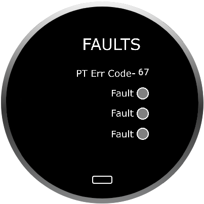
This visual element can be used to communicate the use of a screen, such as "INFO" or "FAULTS". In the image below, Labels are being used for all four(4) instances of the word "Fault" and for "PT Err Code-". These labels do not change at runtime and are always these values.
Guidelines
Any keyboard character can be used inside the Label visual element. The only limitation is the width of the screen relative to font size. Once a line of text exceeds the width of the viewable area it will no longer be displayed. This tool displays a single line of text. Currently, text wrapping and text justification are not supported.
Numeric Value
A numeric value tied to a Value ID that can be changed at runtime. Once the size, font, color, and location are set in GUIDE they can only be changed from GUIDE. Only the value of the number itself can be changed at runtime.
Settings
Modify the internal GUIDE name of the visual element
Adjust the position of the visual element using (x,y) coordinates
Within the GUI the visual element's position can be changed by dragging with the mouse or modifying the (x,y) values
Font
Only the 9 fonts included in GUIDE are currently available
Font Size
Prefix/Suffix
This is a static Prefix, Suffix, or both with the same font, color, and size characteristics as the base visual element
Font Color
Decimal point
Manipulates where the decimal is displayed in the visual element. "Default" will show a value of "12" as "12". "1 Left" will show the value as "1.2" and "1 Right" will show the value as "120"
Options available are: 4 Left, 3 Left, 2 Left, 1 Left, Default, 1 Right, 2 Right, 3 Right, 4 Right
Values
These are the properties of the visual element.
Max/Min: Set the Maximum and Minimum allowable values. The device will not display values below the min or above the max.
Default: Value of the visual element at power-up prior to any input
Step: The incremental change to the visual element caused by an encoder event. A CAN or USB command can still be used to set the value to anything between the Max and Min properties.
Value ID
Sets the Value ID assigned to the visual element. See the communication protocol documentation for how to use this value to SET and GET values for the visual element
Controlled by
Specifies if the visual element is controlled by the encoder
GUIDE can only set one value ID to be controlled by the encoder by default. If the current visual element is set to listen to the encoder-controlled value ID then the word "Encoder" will appear here. Otherwise "Host" will appear. Multiple visual elements can be set to listen to the same value ID.
Event Notifications
Coming Soon
Example
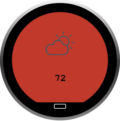
This visual element can be used to communicate any numerical value, such as temperature, pressure, speed, level, version, or selection. In the image below, the numerical value visual element was used to display "72". Per the project file, this value can be any value including and between 0 and 100 and can be changed in step sizes or 1 by turning the encoder (clockwise-> increase, counter-clockwise -> decrease). The visual element can also be changed via CAN or USB command by targeting the relevant value ID.
Guidelines
This visual element displays a 2-byte signed integer value, which provides a total range of -32,767 to 32,766. Using the decimal point property the displayed value can be larger or smaller. Once set in the project file the Font, Size, Position, Prefix/Suffix, Decimal point, Max/Min, and Value ID properties can only be changed in GUIDE and cannot be changed at runtime.
Text box
A dynamic string of letters, numbers, punctuation, and special characters. Once the size, font, color, and location are set in GUIDE these properties can only be changed from GUIDE. At runtime, only the content of the Text box can be changed, not its properties.
Settings
Modify the internal GUIDE name of the visual element
Adjust the position of the visual element using (x,y) coordinates
Within the GUI the visual element's position can be changed by dragging with the mouse or modifying the (x,y) values
Text
This is the default text to be displayed at power-up prior to any external input
Font
Only the 9 fonts included in GUIDE are currently available
Font Size
Font Color
Value ID
Sets the Value ID assigned to the visual element. See the communication protocol documentation for how to use this value to SET and GET values for the visual element
Event Notifications
Coming Soon
Example
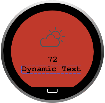
This visual element can be used to communicate any text string. Some common uses are to show error/fault codes and to consolidate screens. In the example below, "Dynamic Text" can be changed at runtime by a CAN or USB command to show any text string, see the communication protocol documents for details. This visual element can be used to make a single screen and numerical value control or report on multiple system-level variables such as actual and set temperatures, speed of multiple tools (tool 1, tool 2, etc.), or volumes on multiple audio channels.
Guidelines
Any UTF-8 2-byte character can be used inside this visual element. The only limitation is the width of the screen relative to font size. Once a line of text exceeds the width of the viewable area it will no longer be displayed. This tool displays a single line of text. Currently, text wrapping and text justification are not supported. Justification can be accomplished with the use of the space (" ") character 0x20 (dec 32). To achieve multiple lines of text, multiple visual elements need to be used.
Image
An image on the screen that does not change with user interactions and/or CAN/USB commands.
Settings
Modify the internal GUIDE name of the visual element
Adjust the position of the visual element using (x,y) coordinates
Within the GUI the visual element's position can be changed by dragging with the mouse or modifying the (x,y) values
Size of the image
The image will not stretch to fit the size provided here, a square image will always be a square, and it'll scale down to match the limiting dimension (width or height)
Padding
The number of pixels along the perimeter between the bounding box and the image
File
Browse for image files
Color
If the selected image is mono-color, its color can be changed
Fill Background Color
Fills the empty/transparent portions of the visual element with a solid color
Event Notifications
Coming Soon
Example
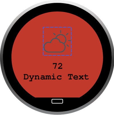
This visual element is used to show a static image. Common uses are to communicate the function of a screen in addition to or instead of words, a gear image for a settings screen, or a fan image for fan speed control.
Guidelines
Image file types support are .jpeg and .png, input files should be a minimum of 640px by 640px so that resolution is not lost when scaled. This visual element is static and can not be changed at runtime, only from GUIDE.
Button
A button that combines the functionality of an image and a touch zone. This visual element has built-in properties to simplify the customization of the GUI.
Settings
Modify the internal GUIDE name of the visual element
Adjust the position of the visual element using (x,y) coordinates
Within the GUI the visual element's position can be changed by dragging with the mouse or modifying the (x,y) values
Size
Padding
The number of pixels along the perimeter between the bounding box and the image
Fill color
The empty/transparent portions of the visual element will be filled with a solid color
Border color
Set the outline/border color of the visual element
Border Width
Sets the thickness/width of the outline/border, which can be set to "0" for no border
Border Corner radius
Adds rounds to the sharp corners of the rectangular visual element. Setting this to half of the button height will add full rounds (pill shape) to the visual element
File
Browse for image files
Color
If the selected image is mono-color, its color can be changed
On-tap action
Defines what will happen when this visual element is tapped
None: Do nothing
Move to: Navigate to another screen
Go to home: Navigate to the screen that is currently defined as "Home"
Set value: Set a value ID to a specific value
Event Notifications
Coming Soon
Example
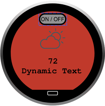
This visual element is used to navigate to another screen or modify an existing value ID. In the example shown below, the button reports that the visual element was tapped so that the Host can turn ON or OFF the temperature control.
Guidelines
Image file types support are .jpeg and .png, input files should be a minimum of 640px by 640px so that resolution is not lost when scaled. This visual element is static and can not be changed at runtime, only from GUIDE.
Bar Graph
A rectangular or pill shape with a filled-in section that can be adjusted according to a numerical value related to a value ID.
Settings
Modify the internal GUIDE name of the visual element
Style
Select one of the built-in visual element styles. Graph 1 is pill-shaped, and Graph 8 is rectangular.
Adjust the position of the visual element using (x,y) coordinates
Within the GUI the visual element's position can be changed by dragging with the mouse or modifying the (x,y) values
Size
Padding
The number of pixels along the perimeter between the bounding box and the filled section
Fill color
Values
These are the properties of the visual element.
Max/Min: Set the Maximum and Minimum allowable values. The device will not display values below the min or above the max.
Default: Value of the visual element at power-up prior to any input
Step: The incremental change to the visual element caused by an encoder event. A CAN or USB command can still be used to set the value to anything between the Max and Min properties.
Value ID
Sets the Value ID assigned to the visual element. See the communication protocol documentation for how to use this value to SET and GET values for the visual element
Controlled by
Specifies if the visual element is controlled by the encoder
GUIDE can only set one value ID to be controlled by the encoder by default. If the current visual element is set to listen to the encoder-controlled value ID then the word "Encoder" will appear here. Otherwise "Host" will appear. Multiple visual elements can be set to listen to the same value ID.
Event Notifications
Coming Soon
Example
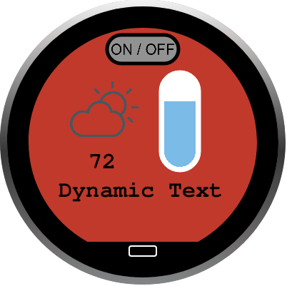
This visual element can be used to communicate any numerical value, such as temperature, pressure, speed, or level graphically. In the image below, the visual element was used to graphically display "72" in addition to the numerical value. Per the project file, this value can be any value including and between 0 and 100 and can be changed in step sizes of 1 by turning the encoder (clockwise-> increase, counter-clockwise -> decrease). The visual element can also be changed via CAN or USB command by targeting the relevant value ID.
Guidelines
This visual element displays a numerical value as a percentage of the specified range (max-min). This visual element is controlled by a 2-byte signed integer, which provides a total possible range of -32,767 to 32,766. If the visual element has a range from 0-100 and the controlling value ID is set to 75, the visual element will be 75% filled. Once set in the project file the Style, Size, Position, Padding, Fill color, Max/Min, Default, Step, and Value ID properties can only be changed in GUIDE and cannot be changed at runtime. To ensure the expected behavior, do not overlap this visual element with the Lighted Icon or Ring Gauge visual elements.
Ring Gauge
An arc shape with a filled-in section that can be adjusted according to a numerical value related to a value ID.
Settings
Modify the internal GUIDE name of the visual element
Adjust the position of the visual element using (x,y) coordinates
Within the GUI the visual element's position can be changed by dragging with the mouse or modifying the (x,y) values
Style Start Angle
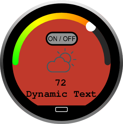
Define where the arc should start. This value is in degrees and has a range of 0-360. Zero (0) degrees is located where East would be on a compass or "3" on a clock face. In the example below this is set to 180.
Sweep
The length/sweep of the arc. This value is in degrees and has a range of 1-360. In the example below this value is set to 180, and sweeps around half of the screen.
Cursor visibility
Toggle the visibility of the cursor ON or OFF
Cursor
Defines the diameter of the cursor in pixels
Thickness
Defines the thickness of the arc in pixels
Radius
Defines the radius of the arc measured from the center of the display to the midpoint of the arc thickness. To have the outside edge of the arc coincide with the outermost edge of the 320*300 display, the radius + 1/2 the thickness should equal 160. In the example below the radius is 150 and thickness is 20.
Rounded corner
Toggle rounded corners ON or OFF. In the example below the corners are ON.
Colors Ring
Defines the solid color of the arc that is not filled
Colors Track
Defines the solid or gradient color of the arc that is filled. A gradient will be automatically generated from the colors selected. Add colors as needed and delete all but one color to have a solid fill.
Colors Cursor
Defines the color of the cursor
Values
These are the properties of the visual element.
Max/Min: Set the Maximum and Minimum allowable values. The device will not display values below the min or above the max.
Default: Value of the visual element at power-up prior to any input
Step: The incremental change to the visual element caused by an encoder event. A CAN or USB command can still be used to set the value to anything between the Max and Min properties.
Value ID
Sets the Value ID assigned to the visual element. See the communication protocol documentation for how to use this value to SET and GET values for the visual element
Controlled by
Specifies if the visual element is controlled by the encoder
GUIDE can only set one value ID to be controlled by the encoder by default. If the current visual element is set to listen to the encoder-controlled value ID then the word "Encoder" will appear here. Otherwise "Host" will appear. Multiple visual elements can be set to listen to the same value ID.
Event Notifications
Coming Soon
Example
This visual element can be used to communicate any numerical value, such as temperature, pressure, speed, or level graphically. In the image below, the visual element was used to graphically display "72" in addition to the numerical value. Per the project file, this value can be any value including and between 0 and 100 and can be changed in step sizes of 1 by turning the encoder (clockwise-> increase, counter-clockwise -> decrease). The visual element can also be changed via CAN or USB command by targeting the relevant value ID.
Guidelines
This visual element displays a numerical value as a percentage of the specified range (max-min). This visual element is controlled by a 2-byte signed integer, which provides a total possible range of -32,767 to 32,766. If the visual element has a range from 0-100 and the controlling value ID is set to 75, the visual element will be 75% filled. Once set in the project file the Style, Position, Track Color, Ring Color, Max/Min, Default, Step, and Value ID properties can only be changed in GUIDE and cannot be changed at runtime. To ensure the expected behavior, do not overlap this visual element with the Lighted Icon or Bar Graph visual elements. Graphic design files specifications: https://grayhill.atlassian.net/wiki/download/attachments/64520198/ring-gauge-guidelines.ai
Dynamic Images
Displays one (1) image out of a group of images displayed in the same bounding box (size and position) based on the value of the associated value ID.
Settings
Modify the internal GUIDE name of the visual element
Image Set
Defines the group of images to be used. Can also change the color of mono-color images.
Adjust the position of the visual element using (x,y) coordinates
Within the GUI the visual element's position can be changed by dragging with the mouse or modifying the (x,y) values
Size
All images of the group will scale to fit into a bounding box with the size defined here
Value ID
Sets the Value ID assigned to the visual element. See the communication protocol documentation for how to use this value to SET and GET values for the visual element
Values
These are the properties of the visual element.
Max/Min: Set the Maximum and Minimum allowable values. The device will not display values below the min or above the max.
Default: Value of the visual element at power-up prior to any input
Step: The incremental change to the visual element caused by an encoder event. A CAN or USB command can still be used to set the value to anything between the Max and Min properties.
Event Notifications
Coming Soon
Example
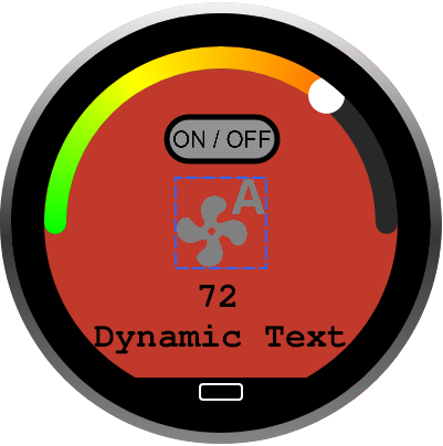
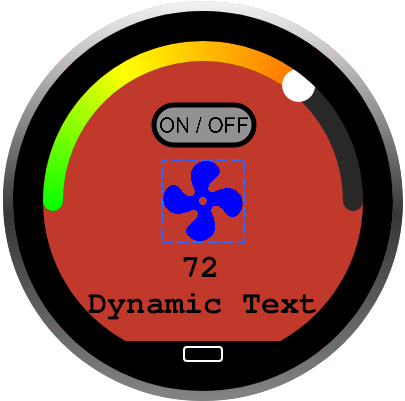
This visual element can be used to display one out of a group of images. In the image below, the dynamic images visual element was used to display the "auto-fan" image by default, but could be controlled to show a red "heating fan" icon or a blue "cooling fan" icon. Per the project file, the dynamic image visual element has all three (3) of these images available and will show the relevant image based on the value of the controlling value ID. This value ID, and thus which images to show, can be controlled with user input or via CAN or USB commands.
Value ID = 0x00 | Value ID = 0x02 |
|---|---|
 |  |
Guidelines
This visual element displays an image based on the value of a value ID. The images used should be at least 640px by 640px to ensure no loss of resolution when scaled. All images in the group should also be the same size so they are all scaled the same way and appear as expected. Once set in the project file the images in the group, Position, Size, Min/Max, Default, and Step can only be changed from GUIDE, they cannot be changed at runtime.
Radio Group
Controls multiple bounding boxes that hold images. Each bounding box can only have two(2) images or the same images in different colors.
Settings
Modify the internal GUIDE name of the visual element
Value ID
Sets the Value ID assigned to the visual element. See the communication protocol documentation for how to use this value to SET and GET values for the visual element
Multiselection
Toggles multiselection ON or OFF. If ON, multiple images can be active at the same time. If OFF, only one(1) image can be active at a time.
Event Notifications
Coming Soon
Image: Modify the internal GUIDE name of the visual element
Image: Active
Select the image and image color to be used when this visual element is set to Active
Image: Inactive
Select the image and image color to be used when this visual element is set to Inactive Image: Active
Sets the default stat of the current image, Active or Inactive
Image: Adjust the position of the visual element using (x,y) coordinates
Within the GUI the visual element's position can be changed by dragging with the mouse or modifying the (x,y) values
Image: Size of the image
The image will not stretch to fit the size provided here, a square image will always be a square, and it'll scale down to match the limiting dimension (width or height)
Image: Padding
The number of pixels along the perimeter between the bounding box and the image
Image: Event Notifications
Coming Soon
Example
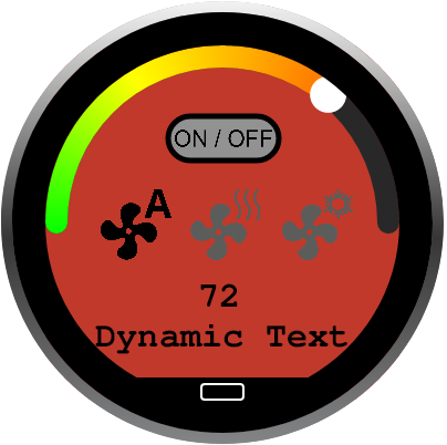
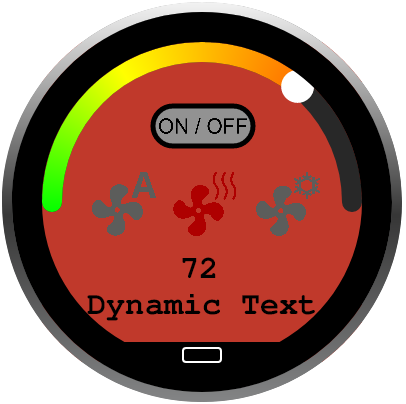
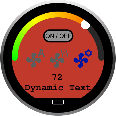
This visual element can be used to toggle the state of a number on images between Active and Inactive. In the example below, this visual element is used to control the appearance of three(3) images. While inactive each image is gray, when active they have a solid color (black, red, blue). The state of all three(3) images is controlled by a sinlge value ID.
Value ID = 0x00 | Value ID = 0x01 | Value = 0x02 |
|---|---|---|
 |  |  |
With Multiselect OFF, if this visual element has 3 bounding boxes then it has a total of 3 states.
State 1: Image 1 Active, 2/3 Inactive
State 2: Image 2 Active, 1/3 Inactive
State 3: Image 3 Active, 1/2 Inactive
Value ID = 0x00 | Value ID = 0x01 | Value = 0x03 |
|---|---|---|
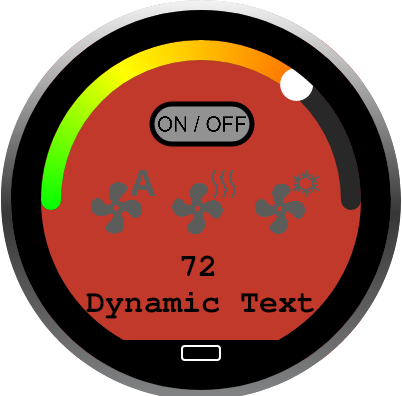 |  | 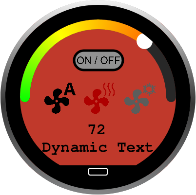 |
With Multiselect ON, if this visual element has 3 bounding boxes then it has a total of 8 states.
State 1: None Active, 1/2/3 Inactive
value ID = 0 0 0 0 -> 0x00
State 2: 1 Active, 2/3 Inactive
value ID = 0 0 0 1 -> 0x01
State 3: 2 Active, 1/3 Inactive
value ID = 0 0 1 0 -> 0x02
State 4: 1/2 Active, 3 Inactive
value ID = 0 0 1 1 -> 0x03
State 5: 3 Active, 1/2 Inactive
value ID = 0 1 0 0 -> 0x04
State 6: 1/3 Active, 2 Inactive
value ID = 0 1 0 1 -> 0x05
State 7: 2/3 Active, 1 Inactive
value ID = 0 1 1 0 -> 0x06
State 8: 1/2/3 Active, None Inactive
value ID = 0 1 1 1 -> 0x07
Guidelines
This visual element displays a group of images all at once and each image can have two(states) Active and Inactive. How each image appears in each state is defined by project file created in GUIDE. The images used should be at least 640px by 640px to ensure no loss of resolution when scaled, be mono-color, and have transparent backgrounds. All images in the group should also be the same size so they are all scaled the same way and appear as expected. Once set in the project file the images in the group, Position, Size, Color, Default status can only be changed from GUIDE, they cannot be changed at runtime.
Menu
Arranges a set of images into a menu structure. By incrementing or decrementing the controlling value ID the menu items cycle through in the project defined order.
Settings
Modify the internal GUIDE name of the visual element
Value ID
Sets the Value ID assigned to the visual element. See the communication protocol documentation for how to use this value to SET and GET values for the visual element
Event Notifications
Coming Soon
Item: Modify the internal GUIDE name of the visual element
Item: Image
Select the image and image color
Image: Adjust the position of the visual element using (x,y) coordinates
Within the GUI the visual element's position can be changed by dragging with the mouse or modifying the (x,y) values
Image: Size of the image
The image will not stretch to fit the size provided here, a square image will always be a square, and it'll scale down to match the limiting dimension (width or height)
Image: Padding
The number of pixels along the perimeter between the bounding shape and the image
Fill Background
Specify the color to fill all transparent portions of the image
On tap action
Define what happens when the visual element is tapped when the current item is in position #1
Image: Event Notifications
Coming Soon
Example
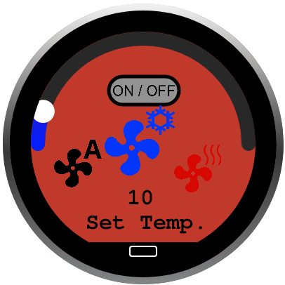
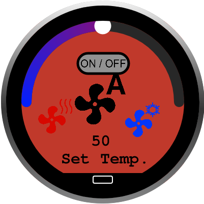
This visual element can be used to build a simple navigation menu where each image navigates to a specified screen when tapped, or can be used to select from a group of presets. In the example below, the menu visual element is used to store three (3) preset values for the set temperature. In GUIDE, each item is assigned to change the set temperature to a static value [hot - 90, cold - 10, auto - 50] when tapped and in the first position (larger icon). The encoder is used to switch between the icon in the first position.
"Cold" Icon tapped and in position 1 | "Auto" Icon tapped and in position 1 |
|---|---|
 |  |
Guidelines
The images used should be at least 640px by 640px to ensure no loss of resolution when scaled and have transparent backgrounds. All images in the group should also be the same size so they are all scaled the same way and appear as expected. Once set in the project file the images in the group, Position, Size, Default, and SColors can only be changed from GUIDE, they cannot be changed at runtime.